Kate’s Korner Durham | Logo + Web | 2018
Scope of Work:
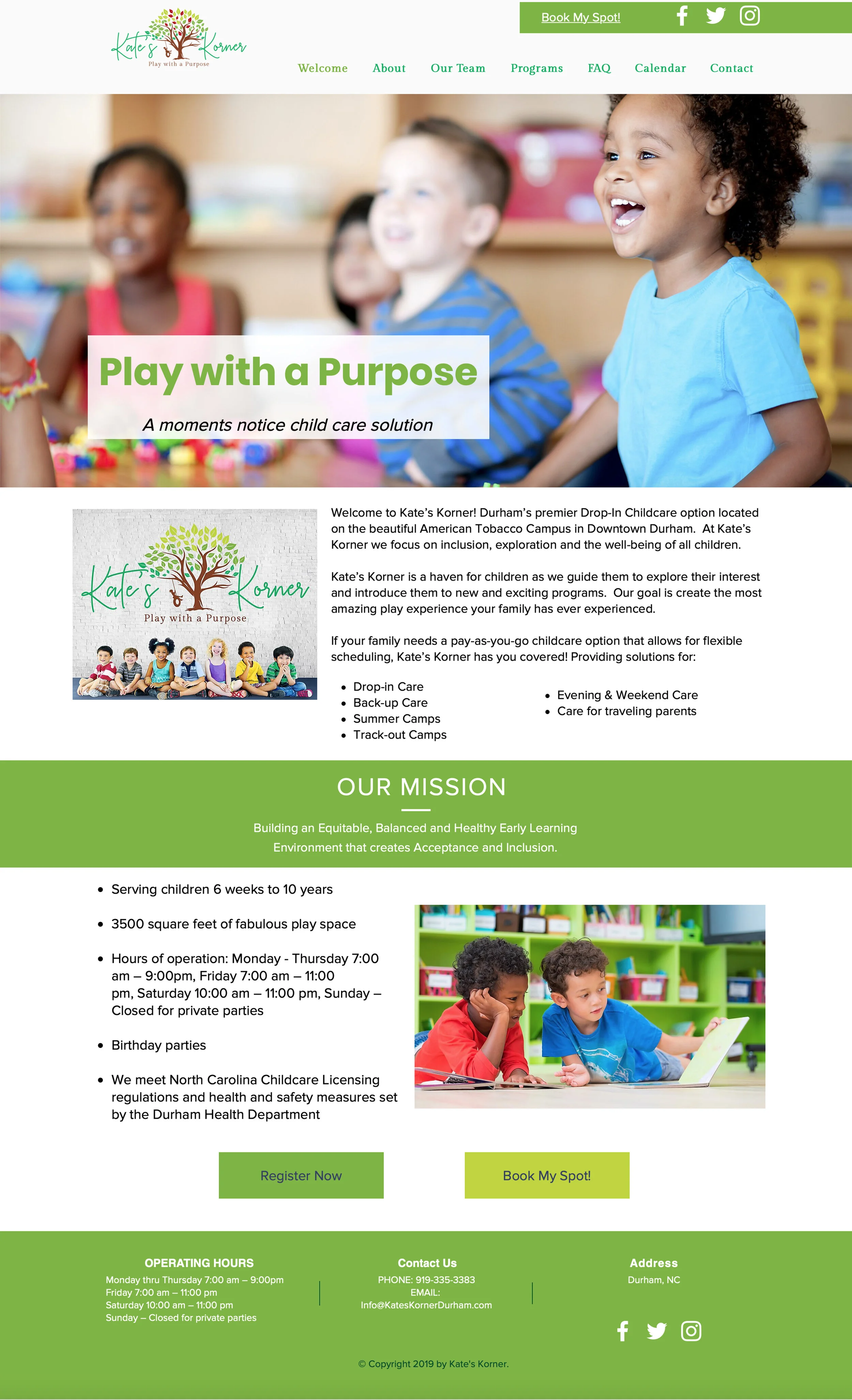
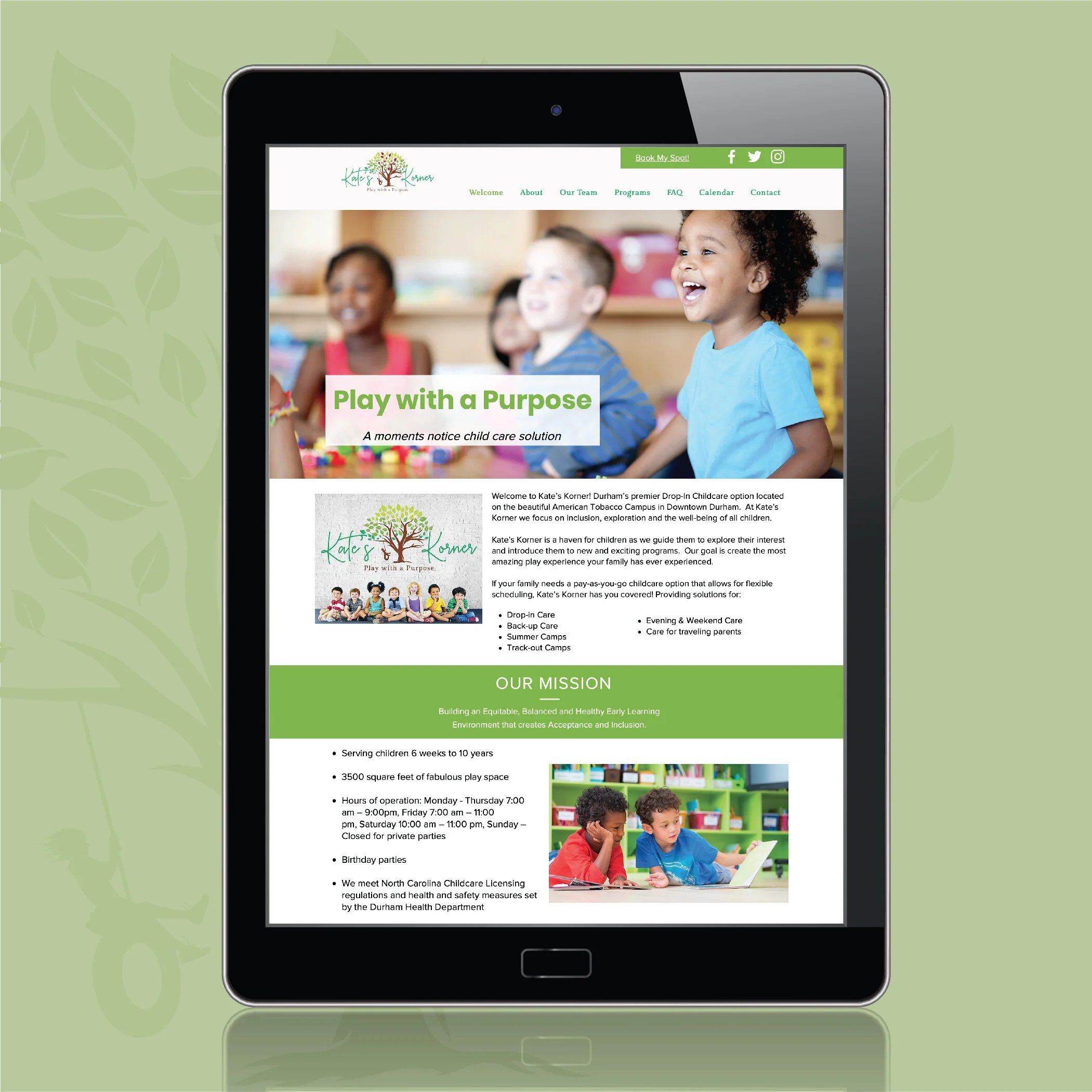
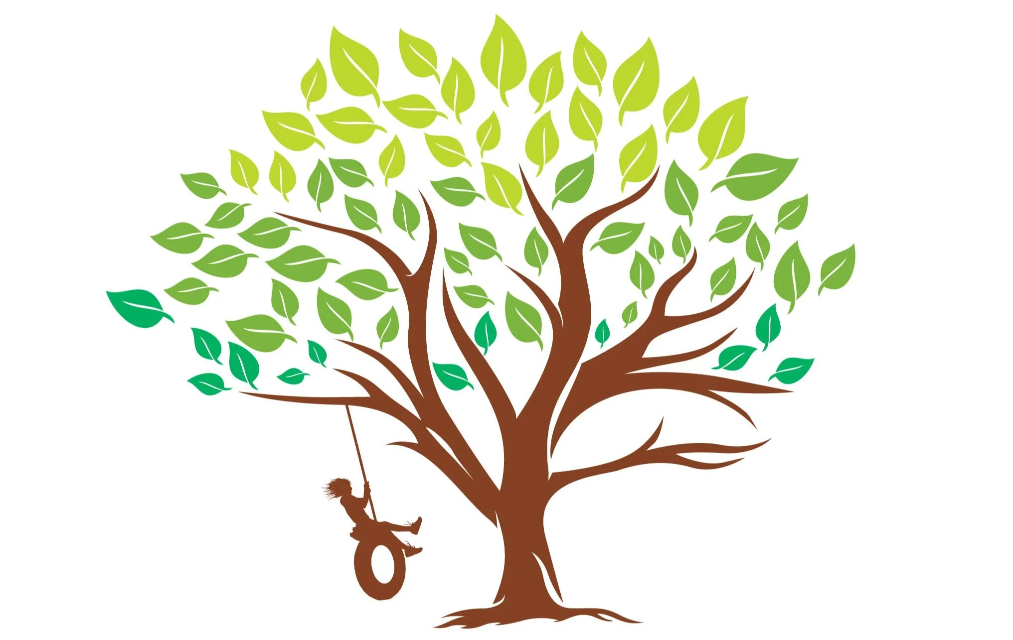
Kate’s Korner Durham is a drop-in childcare option that focuses on inclusion and exploration. A design that incorporated multiple tones of green, a tree to symbolize growth, and a child swinging to harp on the importance of play were all taken into account in the development of the center’s logo. As diversity and inclusion are priorities of the center, the website features vibrant images of smiling children of a range of ethic backgrounds smiling while engaged in learning activities. The website also has simple navigations with the prominent “Book My Seat” registration at the top of the page. Based on studies of competitor sites and user group behavior, parents were most interested in taking a tour, learning about the center’s services, hours of operation, and further how to book a seat for their child at the time needed. Therefore, the home page also provides the right information and links to direct visitors to the primary locations needed. After initial site design, the website was transferred to the company staff for upkeep and changes.
Deliverables:
Logo Design, Style Guide, Website
*Website is currently maintained by client.
LOGO

BRAND COLORS

SUBMARK
WEB DEVELOPMENT